Auxy
Member
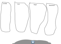
So basically ive made an Dropdown gui:
Gui: Imgur.com
And idk how to improve it, i dont wanna leave it like that since it looks like some russian client gui rn
Also i wanna change the background since every client has a blur and shadow now in their gui and i think overusing it wouldnt look good, maybe i will make it a option
or something but maybe someone has an color idea or how i should do it")
Also i wanna make a extra gui for example configs, i would just put a litte button with an icon at the bottom right that opens the gui (example) but i think that looks lame asf or the second idea was to make like an arrow and the gui slides in, like tenacity as example. Maybe someone has an idea for that too
plz give ideas
Gui: Imgur.com
And idk how to improve it, i dont wanna leave it like that since it looks like some russian client gui rn
Also i wanna change the background since every client has a blur and shadow now in their gui and i think overusing it wouldnt look good, maybe i will make it a option
or something but maybe someone has an color idea or how i should do it
Also i wanna make a extra gui for example configs, i would just put a litte button with an icon at the bottom right that opens the gui (example) but i think that looks lame asf or the second idea was to make like an arrow and the gui slides in, like tenacity as example. Maybe someone has an idea for that too
plz give ideas